Basic Layout Containers
Buttons contained in a Column: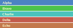
Five Buttons contained in a Row:

Columns and Rows
The Column and Row layout containers are used to lay out child Components in vertical and horizontal series, respectively.
Visual Appearance: By default, a Column or Row will offer no appearance of its own: each container will simply render its children in series with no space between them. Both containers offer a fair amount of configurability if desired, with properties to set borders, backgrounds, inset margins, and cell spacing.
ColumnLayoutData / RowLayoutData
The ColumnLayoutData and RowLayoutData properties may be used with Columns and Rows respectively to describe how each contained child Component is laid out and rendered within the container. These LayoutData implementations offer the capabilities to set the alignment, inset margin, background color, background image, width (RowLayoutData-only) and height (ColumnLayoutData-only) of individual cells.
Buttons contained in a Grid(with
size property at default value of 2):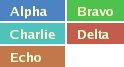
Five Buttons contained in a Grid
(with size property set to 4):

Grids
The Grid component is used to lay out child Components in a two-dimensional matrix of cells. Individual Components within a Grid may be configured (using a LayoutData) to span across multiple horizontal and/or vertical cells.
Grid
(the default):
Vertically-oriented Grid

Horizontally-oriented Grid
with a cell that uses GridLayoutData
to span two columns:

Visual Appearance: Like Rows and Columns, a Grid will by default render its content without additional visual trim and with no space between child Components. The component does provide properties to configure borders, default inset margins for cells, overall width and height, and the individual widths and heights of each column and row of cells rendered.
Orientation and Size: Grids may be horizontally or vertically oriented. A horizontally oriented Grid will lay out its children from left-to-right (assuming a left-to-right language) and then from top-to-bottom. A vertically oriented Grid will lay out its children from top-to-bottom and then from left-to-right. The size property of a Grid will specify the number of columns/rows to move in the first direction before wrapping to the next row/column.
GridLayoutData
The GridLayoutData property object may be set on child Components to describe how each child should be laid out and rendered within the Grid. GridLayoutData allows the setting of alignment, inset margins, background color, background image, column-span, and row-span of each child Component cell.
ColumnSpans and RowSpans: The ColumnSpan and RowSpan properties of the GridLayoutData property object may be used to allow a cell to extend across adjacent horizontal and vertical cells.