User Input Components
This section discusses the use of the various built-in Components that process user input, i.e., buttons, text entry components, and list selection components.
Buttons:
RadioButtons:

CheckBoxes:

Buttons
Echo provides various button components including simple pushbuttons (Buttons) and toggle-able buttons which provide a selection state (RadioButtons and CheckBoxes).
Visual Appearance: All button components may be configured with colors, fonts, borders, background images, custom labels and custom icons. Mouse rollover and button-press effects may be set to alter the appearance of a button when the mouse is within its bounds and when it is being clicked, respectively. Using these various stylistic properties, buttons can be configured to look like HTML links or like traditional buttons found in a GUI application.
Packaging: The concrete button Component classes may be found in the nextapp.echo.app package. Supporting infrastructure including ButtonModels and the AbstractButton and ToggleButton base classes are found in the nextapp.echo.app.button package.
Types of Buttons
Pushbuttons: The Button component is a simple "push" button that provides the user with the capability to invoke an action. Pushbuttons have no selection state.
Checkboxes: A CheckBox is a button which has an on/off selection state. If you click a CheckBox, the selection state will be toggled.
RadioButtons: The RadioButton component enables the user to select one option from a group of options. A RadioButton can be assigned to a ButtonGroup, which will allow only one of its member RadioButtons to be selected at a time.
Events
ActionEvents: When it is clicked, a Button will fire an ActionEvent to all registered ActionListeners. If the ActionCommand property of the Button was set, this information will be included within the ActionEvent. The use of action commands can be beneficial in circumstances where one ActionListener is registered with more than one button.
ChangeEvents: A ToggleButton will fire ChangeEvents in response to changes in its selection state.
Model
All buttons are supported by a data model that implements the ButtonModel interface which provides management of ActionListeners. Toggle-able buttons are backed by a ToggleButtonModel, which is a derivation of ButtonModel that additionally provides selection state information and management of ChangeListeners.
Text Components
TextField:
A PasswordField:

A TextArea:

Text components provide the capability for the user to enter text data into an application. Echo provides three standard text components, all derived from the TextComponent base class:
TextField: The TextField component provides the capability to enter a single line of text.
PasswordField: A derivative of TextField, PasswordField adds a mask to user-input to facilitate on-screen password entry.
TextArea: The TextArea component provides the capability to enter multiple lines of text.
Model
The text displayed in a TextComponent is held within a Document data model object. DocumentListeners may be registered with the Document to receive notification of changes.
Events
DocumentEvents: a TextComponent's Document model will fire DocumentEvents when it is changed.
ActionEvents: ActionEvents are fired by a TextComponent when the enter key is pressed within the component.
List Components
The list components, i.e., SelectField and ListBox, provide the capability to select one or more items from a list of items. List components are derived from the AbstractListComponent base class.
Packaging: The concrete list Component classes may be found in the nextapp.echo.app package. Supporting infrastructure including data model and selection model implementations are found in the nextapp.echo.app.list package.
SelectField:
Types of List Components
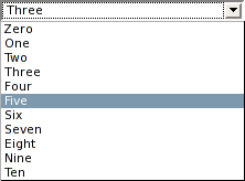
SelectField: A SelectField is a compact list component that opens a drop-down list of selectable choices when clicked. SelectFields only allow one item to be selected at any given time. Only the current selection is displayed when the SelectField's drop-down is inactive.
ListBox:: A ListBox displays a scrollable list of choices within a box. If configured appropriately, a ListBox can allow multiple items to be selected simultaneously (the default behavior is to allow only one item to be selected at a time).
ListBox:

Model
A list component is backed by two models. A ListModel is used to describe the items available for selection. A ListSelectionModel describes the selection state of the list component.
Events
ActionEvents: A list component will fire an ActionEvent when an item is selected (if any ActionListeners are registered).
ChangeEvents: The selection model of a list component will fire ChangeEvents when the selection state has changed.
Web Container: Immediate and Delayed Event Firing
Many of the components mentioned in this discussion have the capability to register very "fine-grained" event listeners which would result in substantial client-server traffic if the server were notified each time an event occurred. For example, a TextComponent would fire a DocumentEvent every time a character was typed. This would obviously be unacceptable for all but the fastest networks. To prevent such problems, the server will only be notified immediately in the event that the user performs an operation which will generate an ActionEvent. Events such as ChangeEvents and DocumentEvents will be fired only when an ActionEvent provides cause to contact the server.
When the server is contacted due to an ActionEvent having occurred, it will first fire any cached delayed events (such as DocumentEvents and ChangeEvents) before the ActionEvent is fired. Duplicate data model events will not be fired: for example, if a user has typed 100 characters into a text field, only one DocumentEvent (rather than 100) will be fired.
