Pane Components
Components which expand to fill an entire region of the screen (both horizontally and vertically) are known as pane components. A pane component is marked by the fact that it implements the Pane interface. Pane components have special requirements as to how they are added to the hierarchy. The parent component of a pane component must be either another pane component or a Window. More specifically, the parent of a pane component must implement the PaneContainer interface.
There are three built-in pane components provided by Echo2: ContentPane, SplitPane, and WindowPane.
ContentPanes
The ContentPane is the simplest of all the pane components. It is simply a container which expands to fill the entirety of a region. Every Echo application will use at least one ContentPane, as the Echo Window component requires that a ContentPane be configured as its sole child.
A ContentPane is generally limited to one child Component. This child will typically be either another pane component such as a SplitPane or a layout container component such as a Column, Row or Grid. Virtually any component is acceptable though.
There is an exception to the one child Component policy of ContentPane: multiple floating window components, such as WindowPanes, may be added to a ContentPane. Such "floating pane" Components must implement the FloatingPane marker interface.
Specifically put, the rule is that a ContentPane may have an unlimited number of children that implement the FloatingPane interface and at most one that does not.
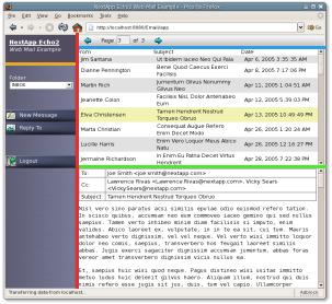
SplitPaneseparators highlighted in bright colors:
SplitPanes
A SplitPane is used to divide a region into two smaller regions either horizontally or vertically. SplitPanes can optionally render a separator bar between the two regions, which can be further configured by the developer to be movable by the user to adjust the relative sizes of the regions.
Nested SplitPanes are commonly used to lay out user interfaces which will occupy the entirety of a browser window. The figure at right shows the E-Mail Example Application which uses multiple SplitPanes to lay out its user interface.
LayoutData: Child components of a SplitPane may provide SplitPaneLayoutData objects that describe how they should be configured within the SplitPane. The use of SplitPaneLayoutData enables the configuration of the minimum and maximum sizes of each pane, scrolling behavior, background colors and images, inset margins, and alignment.
WindowPanes
The WindowPane component renders movable windows that overlay an application. WindowPanes may only be added to a ContentPane. A WindowPane is itself a PaneContainer, thus enabling pane components such as ContentPanes and SplitPanes to be added to it.
Moving and Resizing: The developer may configure whether a WindowPane is allowed to be moved or resized using the setMovable() and setResizable() methods respectively.
Modal Windows: A WindowPane may be made modal by invoking its setModal() method. When a WindowPane's modal state is set, an application will disable all components which are not children of the WindowPane.
Closing Windows: By default, a WindowPane will render with a close button in its upper right-hand corner. This feature may be disabled by setting the Closable property of the WindowPane to false.
Default Close Operations: When a user clicks the close button of a WindowPane, the "default close operation" will automatically be invoked. A WindowPane may be configured with one of three such default close operations: automatically close the window, automatically hide the window, or do nothing (the default).
WindowEvents: WindowListeners can be registered with a WindowPane to receive notification when a user requests it be closed.
WindowPane with a customFillImageBorder rendered withpartially transparent PNG images.
FillImageBorders: The border of a WindowPane is defined using a special type of border property object: a FillImageBorder. The FillImageBorder property object is capable of rendering a graphically themed border around a WindowPane using a series of eight FillImages. Four images are used to describe the corners of the border, with four more being used to draw the sides. FillImageBorders provide the capability to create semitransparent shadow borders as seen in the E-mail Example Application. If only a plain solid color border is desired, a FillImageBorder may be configured with a color setting but without any images.